
The logos of car brands, true emblems of the industry, have traversed the ages by adapting to trends and technological advancements. Over the decades, classic elements like coats of arms and crests have given way to cleaner designs, reflecting values of modernity and innovation. This evolution is not just aesthetic; it also reflects the manufacturers’ desire to strengthen their identity and positioning in a constantly changing market. Logo changes thus tell the story of an industry that, while remaining true to its roots, has continually reinvented itself.
The origins and symbolism of car logos
The first car logos often drew their inspiration from family coats of arms and heraldic symbols, reflecting the aristocratic origins of many manufacturers. These emblems, complex and detailed, conveyed an image of prestige and tradition. Over time, brands simplified their logos to meet the demands of readability and quick recognition.
Recommended read : How much to tip in a Michelin-starred restaurant in France?
Evolution and modernity
The evolution of logos also reflects the advancement of production technologies and materials. For example, the Volkswagen logo, initially complex, has gradually been streamlined to become an instantly recognizable symbol, marking the era of modernity and industrial rationality. This graphic simplification is a general trend in the automotive industry, where logos must be easily identifiable across various media, from bodywork to digital screens.
Symbolism and identity
Logos are not just graphic marks; they embody the soul and values of manufacturers. Here are some examples of frequently used symbols:
Read also : How to Quickly Find the Ideal Car Through Online Classifieds
- Wings: a symbol of speed and freedom, often used by sports car brands.
- Animals: a powerful reminder of strength, agility, or nobility, like the rearing horse.
- Geometric shapes: triangles, circles, and diamonds, representing stability, perfection, and precision.
Each chosen element tells a story and helps forge the brand’s identity with the public. Car manufacturers have thus adapted their visual communication over the ages while retaining the essence of their heritage.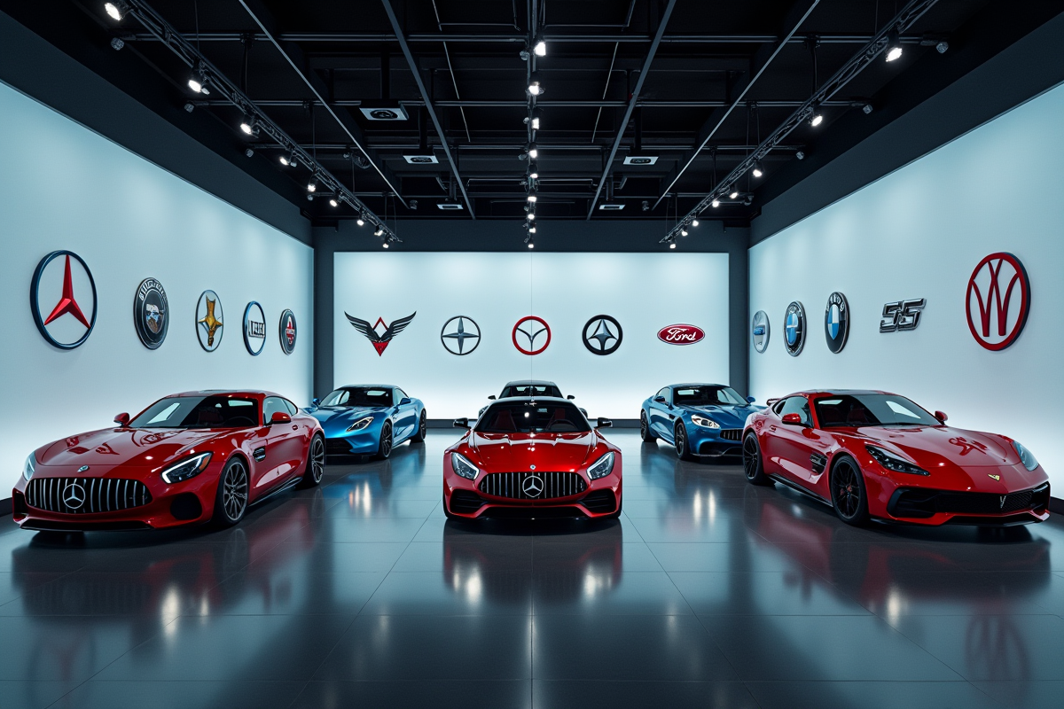
Evolution of logos over the decades and current trends
Car logos have undergone numerous transformations, reflecting the cultural and technological changes of each era. In the 1920s and 1930s, logos were often complex and ornate, designed to symbolize prestige and elegance. During the 1950s and 1960s, the rise of mass culture and visual media prompted manufacturers to simplify their logos for better recognition.
The 1970s and 1980s
The following decades saw a trend towards geometrization and abstraction. Clean shapes and bright colors were in vogue. This period was marked by a desire for modernity and innovation, with logos often associated with concepts of speed and technology. Manufacturers sought to stand out in an increasingly competitive market.
Current trends
Today, logos tend to return to more minimalist designs, but with digital technology in mind. Brands are adopting flexible and adaptable logos for various media, from signage to user interfaces. Here are some notable trends:
- Flat design: flat logos without shadows for better digital readability.
- Monochrome: the use of a single color for more simplicity and elegance.
- Adaptability: logos that can transform and adapt to different sizes and formats.
Car manufacturers continue to play with shapes and colors to stay at the forefront of modernity while honoring their historical heritage.